Building Life Back Into B2B Interfaces

Introduction
At Topsort, we design with artistic and scientific principles in mind because understanding how people process information, form mental models, and build trust makes us better at our jobs. These aren't abstract theories—they're practical tools for creating interfaces and experiences that feel intuitive. Not because they're simple, but because they align with how humans tend to think.
Here are three examples of applying UX fundamentals to real product challenges. Each one draws on established principles from human-computer interaction: visibility of system state, recognition over recall, and feedback through visual communication.
The Examples
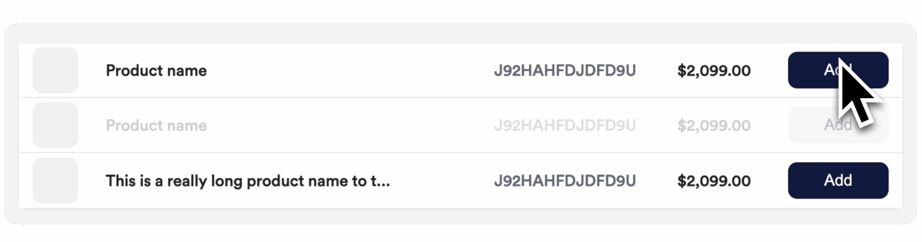
Example 1: Product row states that actually communicate
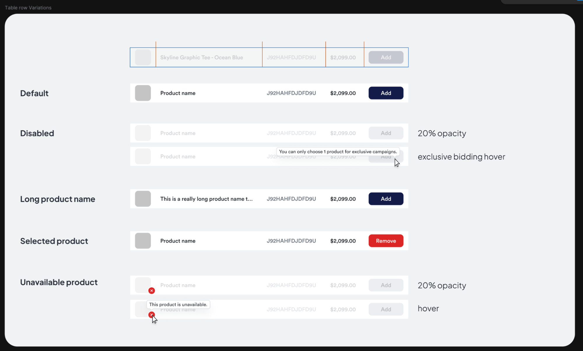
The opportunity
An early version of the product picker had a common problem: disabled rows were just grayed out with no explanation. If a product was unavailable or you'd hit a campaign limit, you'd have to guess why you couldn't select it.
Why it matters
This violates one of the fundamental usability heuristics: visibility of system status. When the system doesn't communicate its state, we form incorrect mental models. We wonder: "Is this broken? Did I do something wrong? Is this a bug?" Ambiguity creates cognitive load and erodes trust.
The approach
We mapped out every possible row state—default, disabled, selected, unavailable, long names—and designed explicit treatments for each. Disabled rows now show tooltips explaining why they're disabled. Unavailable products are visually distinct with clear messaging on hover. The interface now answers the question before you even have to ask.
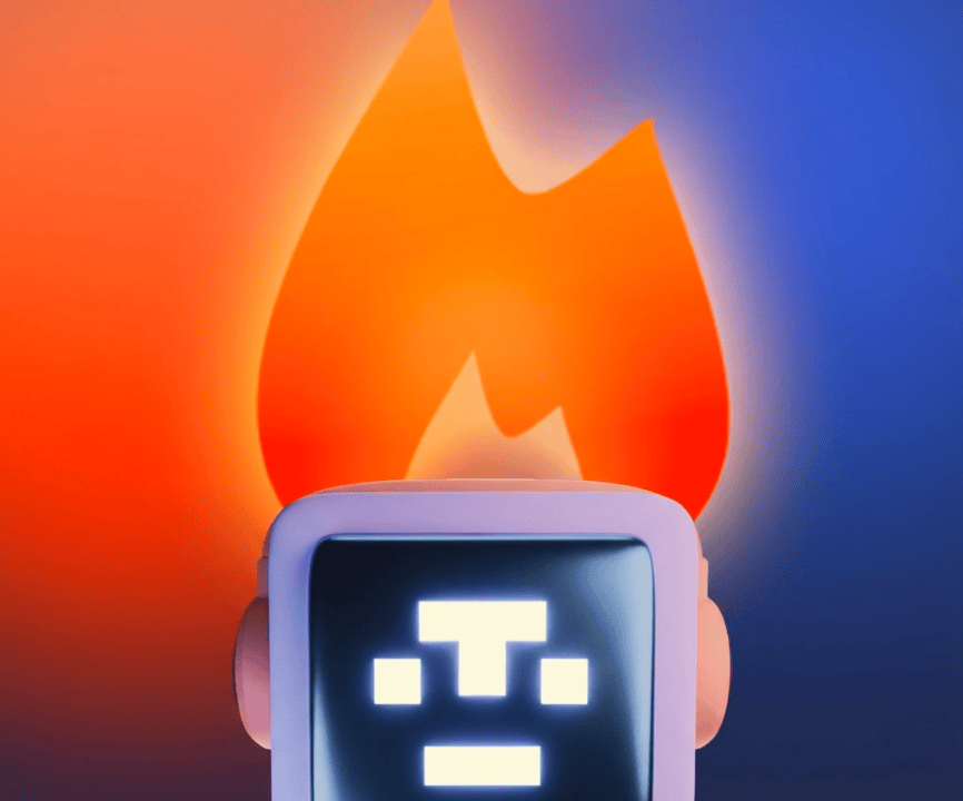
Example 2: Building life back into bidding
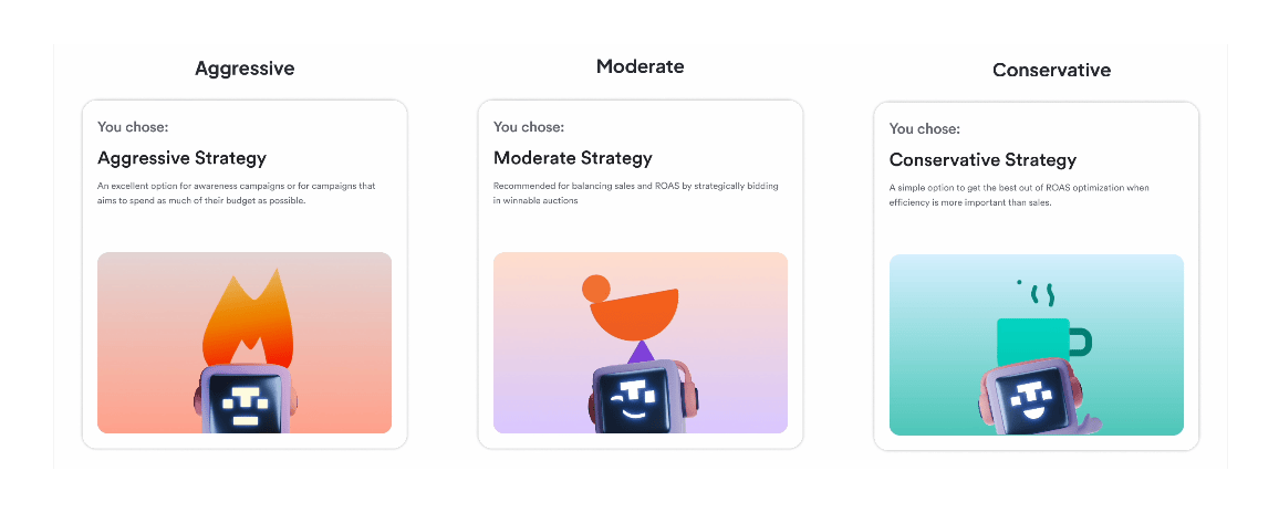
The opportunity
The bidding strategy picker worked. You'd select an option—Conservative, Moderate, Aggressive—and the card would highlight to confirm your choice. Clean, clear, functional. It was fine, but great is where we land.
Why fine isn't good enough
Cognitive psychology tells us that people process visual information faster than text, and metaphor helps us understand abstract concepts. Bidding strategy is inherently abstract—what does "aggressive" really mean in the context of ad auctions?
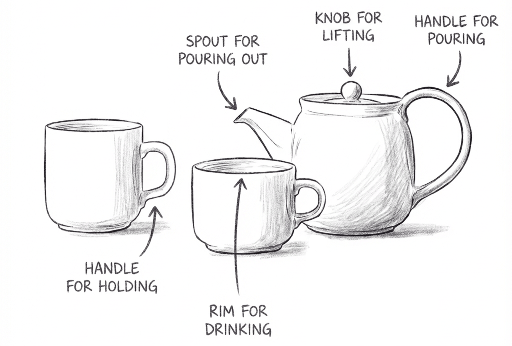
There's also the question of confirmation. Physical objects give us tactile feedback: you feel a teapot's handle in your grip, the satisfying click of a button. A well-designed object tells you how to use it through its shape alone—a spout shows where liquid will pour, a handle invites you to grab it. Digital interfaces don't have that physicality, so we lean on visual cues instead: buttons that look pressable, cards that respond when you hover, and animations that say "yes, we got that."
The highlight-on-click gave you confirmation, but we wanted something more—something that made the choice feel meaningful and helped the concepts stick.
The approach
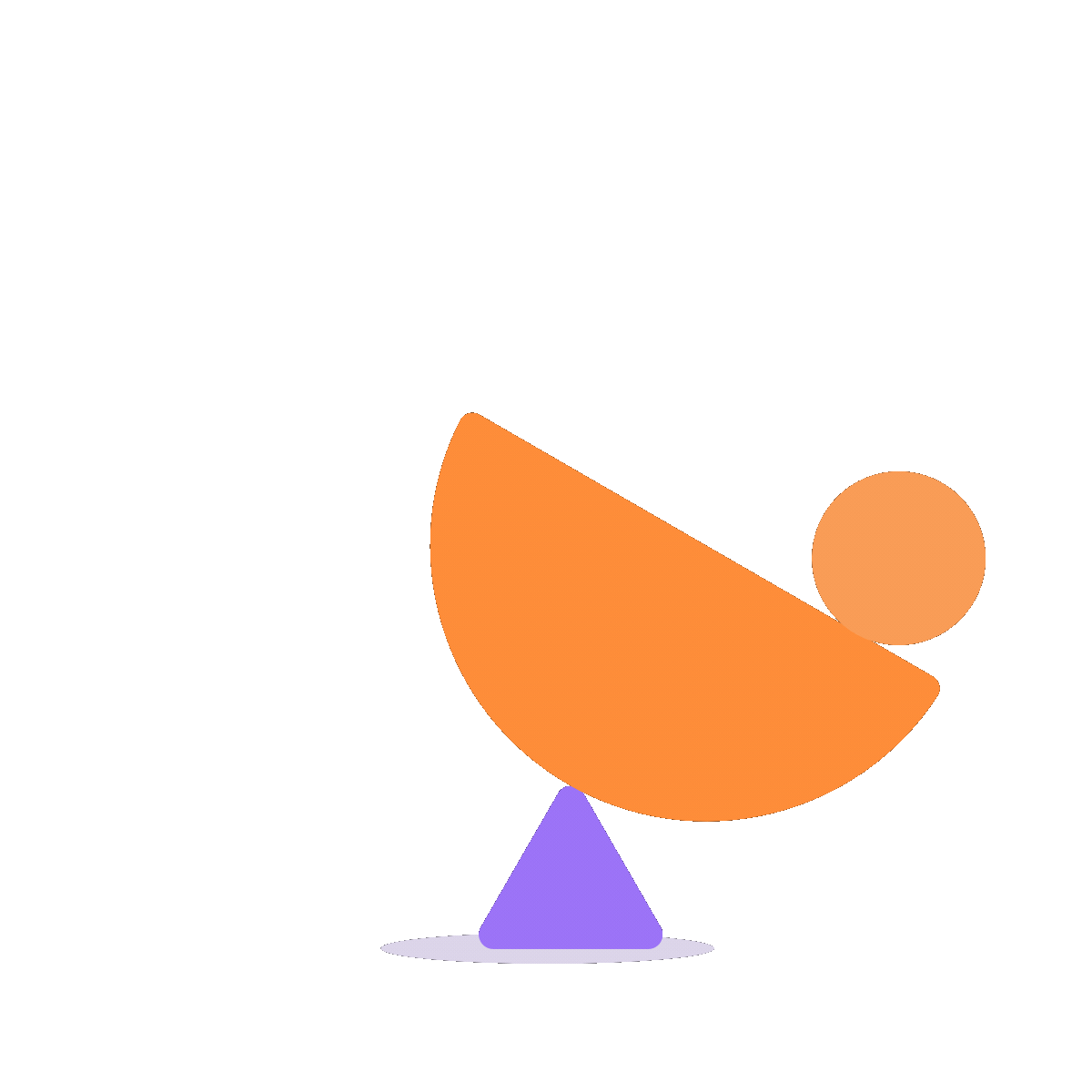
We added animated illustrations featuring our mascot, Toppie, in different modes for each strategy. Aggressive gets flames, Conservative gets a warm beverage, and Moderate gets a balance. The cards animate on selection, adding personality and creating a moment of delight. Visual metaphor makes the abstract concrete, memorable character design makes it stick, and the animation reinforces that tactile "got it" feeling the original card highlight aims for—just turned up.
Example 3: Show what you've selected
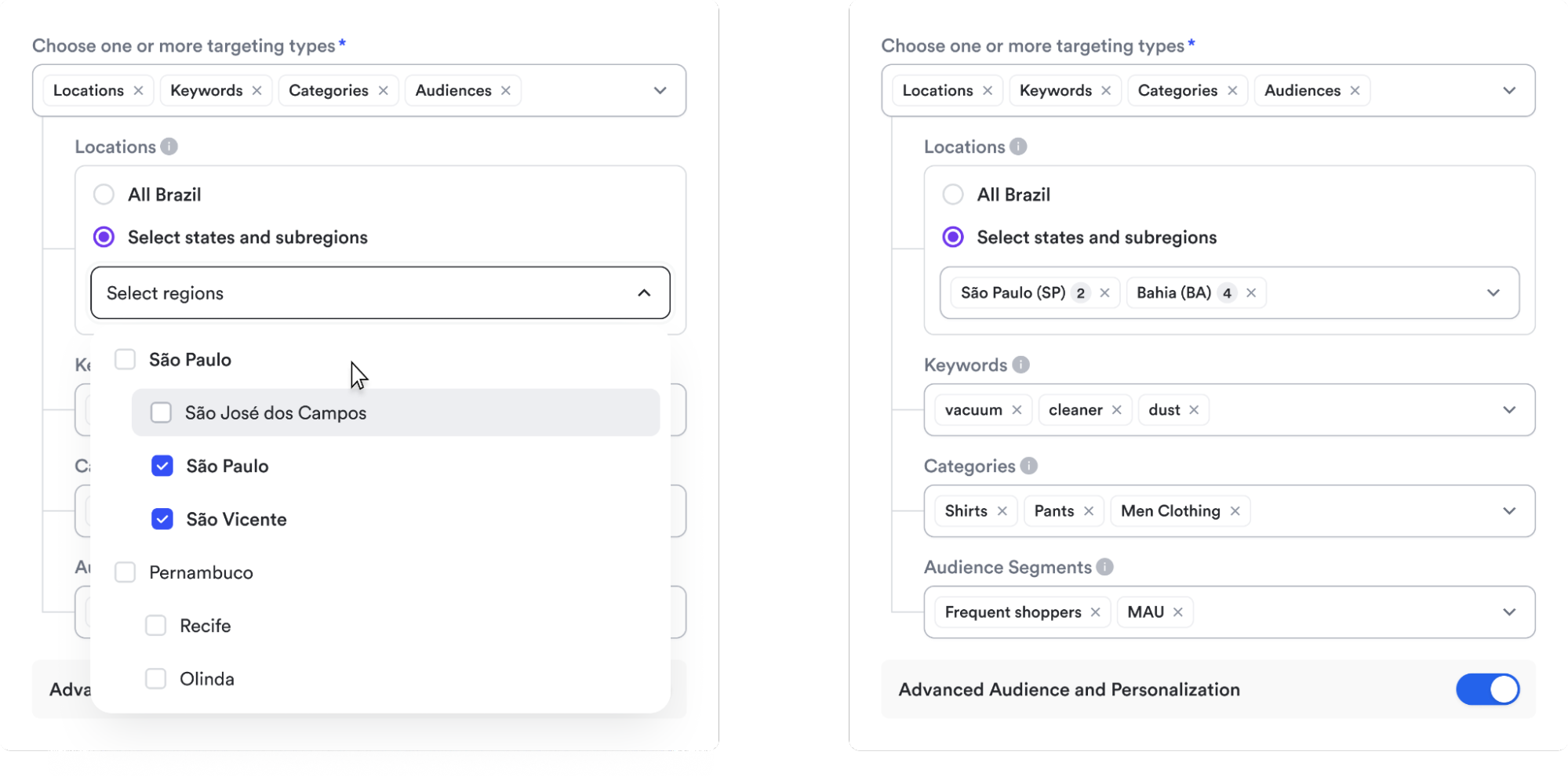
The opportunity
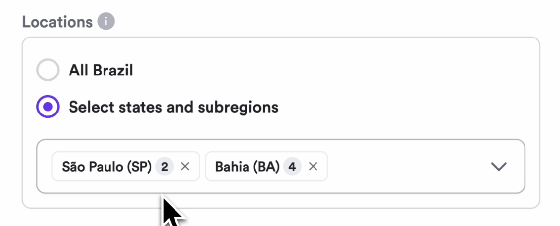
When you selected targeting options (Locations, Keywords, Categories, or Audiences), their selections disappeared into a dropdown menu. You had to reopen it to remember what you'd picked. For location targeting with nested regions like São Paulo (SP), where multiple subregions are selected, there was no way to see your choices at a glance.
The deeper issue
This comes down to recognition vs. recall. Try to remember what you had for lunch three days ago. Hard, right? Now imagine someone showing you a photo of it—instant. That's the difference. Seeing is easier than remembering. Forcing you to remember what they selected creates unnecessary cognitive load. Recognition (seeing your selections) is always easier than recall (remembering what you picked). Hidden state also violates the principle of visibility—if you can't see their selections, they can't verify them, leading to anxiety and repeated checking.
The approach
We turned the dropdowns into multi-select tag displays. Now selections are always visible as removable chips. For locations, we show the state abbreviation and count: São Paulo (SP) 2 tells you exactly what's selected. Same pattern for keywords, categories, and audience segments. Everything is scannable, editable, and clear. You can now recognize their selections at a glance rather than recall them.
Fundamentals Matter
These aren't just design preferences—they're applications of well-researched cognitive principles. When we talk about "great UX," or product design, we're really talking about interfaces that align with how human cognition works: limited working memory, pattern recognition, the need for feedback, and the formation of mental models.
Small violations of these principles compound. A confusing disabled state here, hidden selections there—individually they're minor friction, but together they create cognitive load that accumulates throughout the user journey. You start to wonder: "Is this working? Did I do something wrong? Can I trust this platform with my ad budget?"
Some of the best interfaces just feel obvious, intuitive, and somehow natural. They answer questions before you ask, confirm actions immediately, and make the system state visible. Some call this “polish” or "craft," like it's some artisanal luxury—something you add when you have extra time. It's not. This is the work. Understanding how people think and building accordingly isn't polish, it's the foundation. If your interface doesn't align with human cognition, it doesn't matter how many features you ship—no one will trust it.
.png)